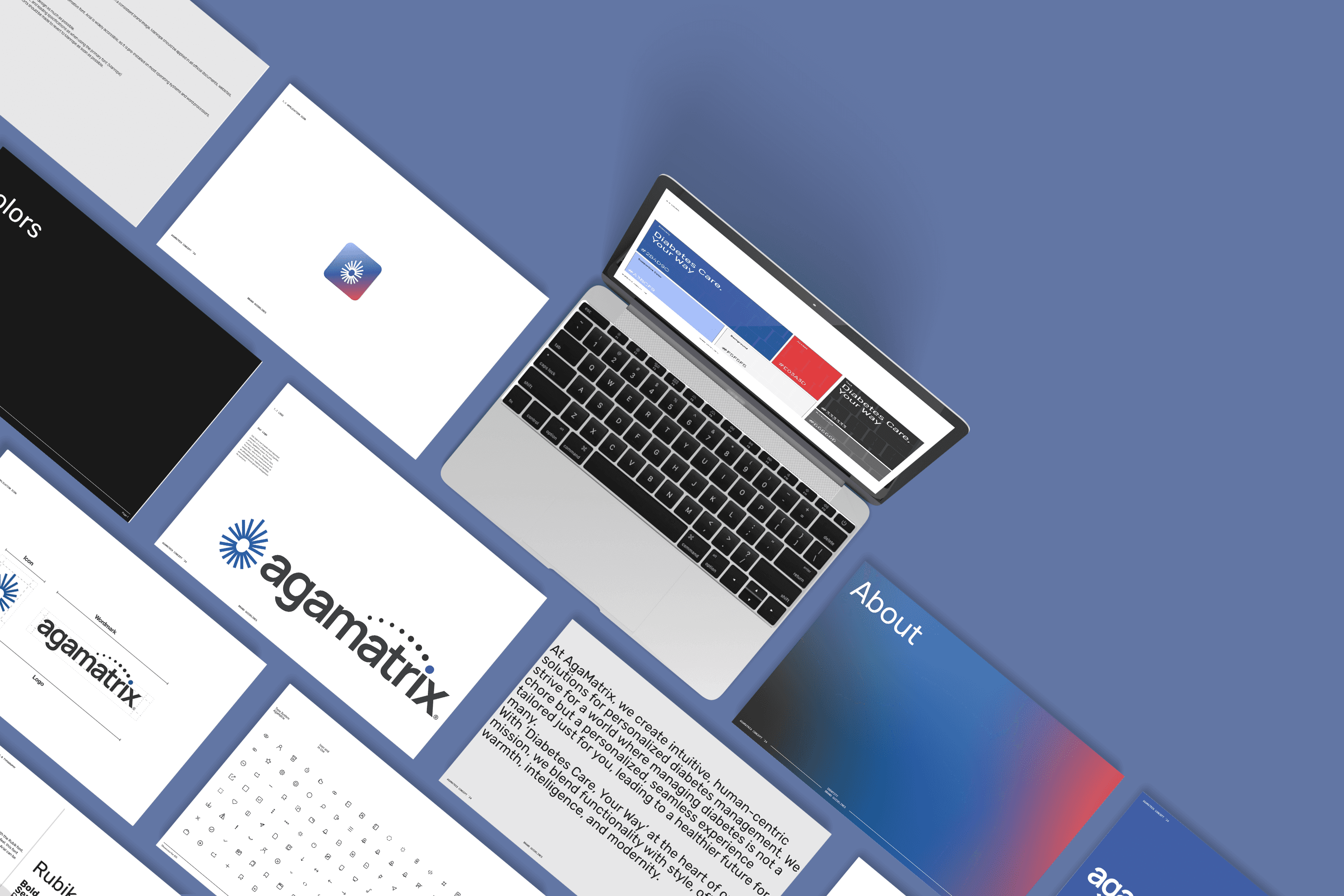
AgaMatrix
Brand Identity
Redefining the Brand with
Cost-Efficient Product and Packaging Redesign
Align brand identity and packaging design to create a cohesive, modern, and cost-efficient experience across platforms
My first assignment after joining the company was to update the brand identity. Design a trustworthy and user-friendly brand identity for AgaMatrix that reflects the empowering message of "Diabetes Care, Your Way" and enhances the user experience of existing products.
Increased satisfaction by 30% post-redesign
Reduced manufacturing costs by 20%
Impacts
Production began in Q3 2024, delivering outcomes such as a 20% reduction in manufacturing costs and a 30% increase in satisfaction. The redesigned packaging will be included in the 2025 Q1 build, projecting further visible revenue growth.
20%
Cost Reduction
Improved
Cross Platform Usability
30% Increased
Satisfaction Growth
PROJECT GOAL
OUTCOMES
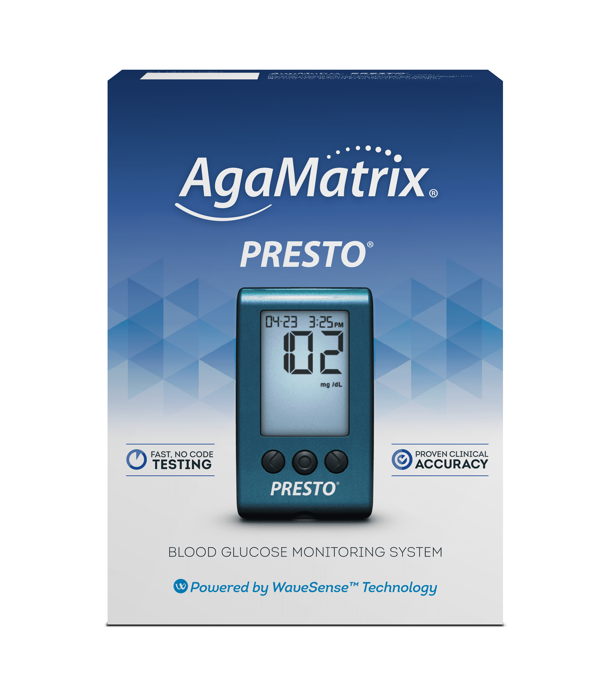
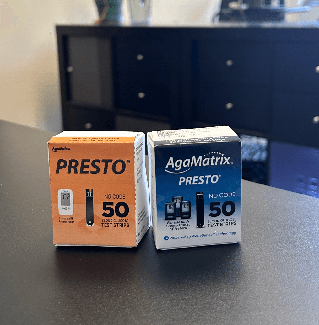
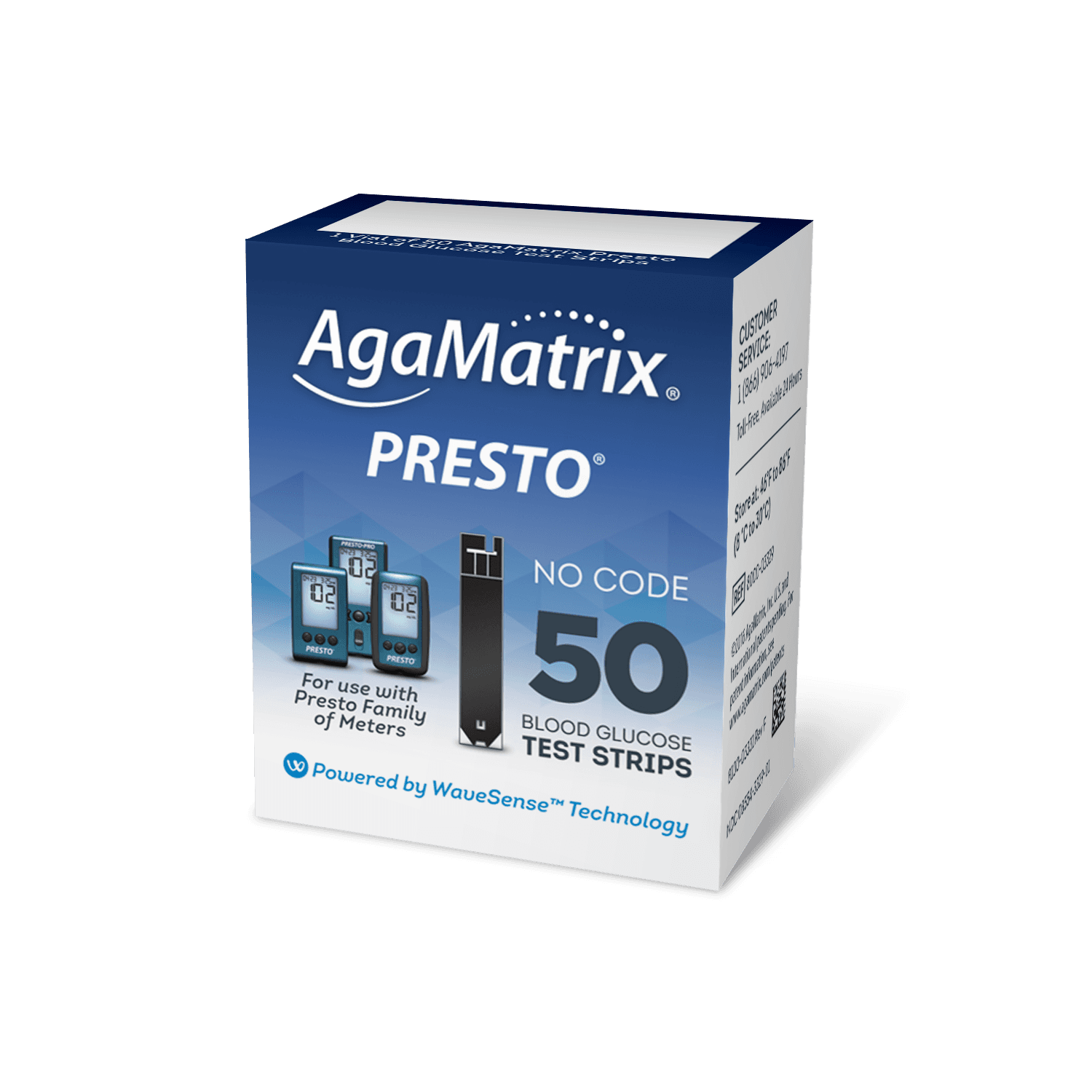
Redesigned version
New Process: $5/unit
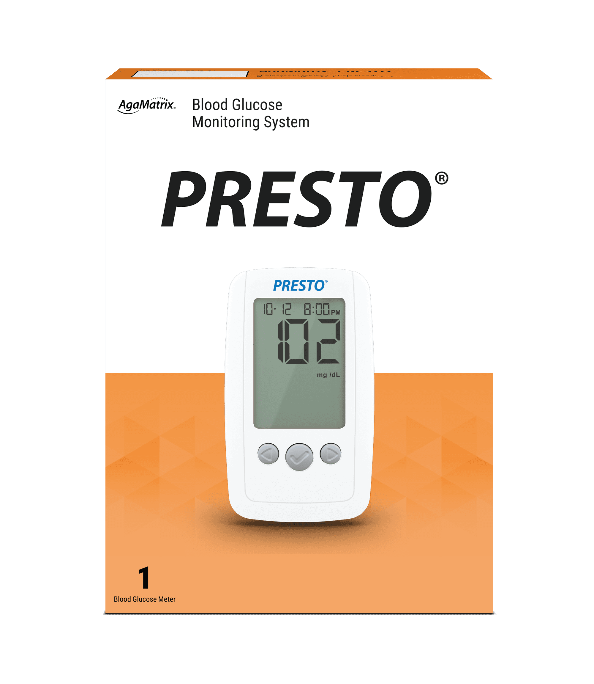
Before vs. After
According to internal survey
Old Logo & Packaging

Web
Package
Marketing Images
Product Design
Package Design
Data Driven Dicision
Graphic Design
My Role
Product Designer
Product Manager
Apply to Digital/Physical product
Timeline
2024 Q2-Q4
Team
Designer: Jaein Kim
Engineer: Tyler Ryu
IT: David Crafts
Skills
Product Design
Package Design
Graphic Design
Adobe Creative Suite
Arena Empower
Impact
Main Takeaways & What I would do differently
KEY ACHIEVEMENTS
Brand Identity: Due to unforeseen internal circumstances, we were unable to revise the brand logo during the identity development phase. Going forward, I'll prioritize closer collaboration with the finance team from the outset to ensure that all potential limitations are considered.
Documentation: The medical device industry places a strong emphasis on comprehensive documentation. This project has provided me with invaluable experience in developing effective documentation procedures. I'm proud of the growth and accomplishments achieved through this large-scale endeavor.
Cross-Functional Collaboration: While working independently on this project, I had to closely collaborate with regulatory, engineering, and sales teams to secure approvals. These interactions have broadened my knowledge and skill set.
GROWTH OPPORTUNITIES
Proactive Financial Collaboration: I would involve the finance team earlier in the process to ensure alignment on branding and design decisions.
Additional Documentation Training: Given the importance of documentation in this industry, I would seek further training to enhance my skills.
REFLECTION
By closely collaborating with sales and production teams, I was able to contribute to significant project achievements within three months, including substantial cost reductions in production and a notable increase in sales.
Some information redacted due to NDA
130% Growth
Achieved a 130% sales increase through strategic Amazon A+ Content updates
20% Cost Saving
20% reduction in manufacturing costs due to simplified meter cover materials.
SOLUTION & EXECUTION
After Feedback, Add “At a Glance” Webpage
SOLUTION & EXECUTION
Old Webpage Structure
New Webpage Structure
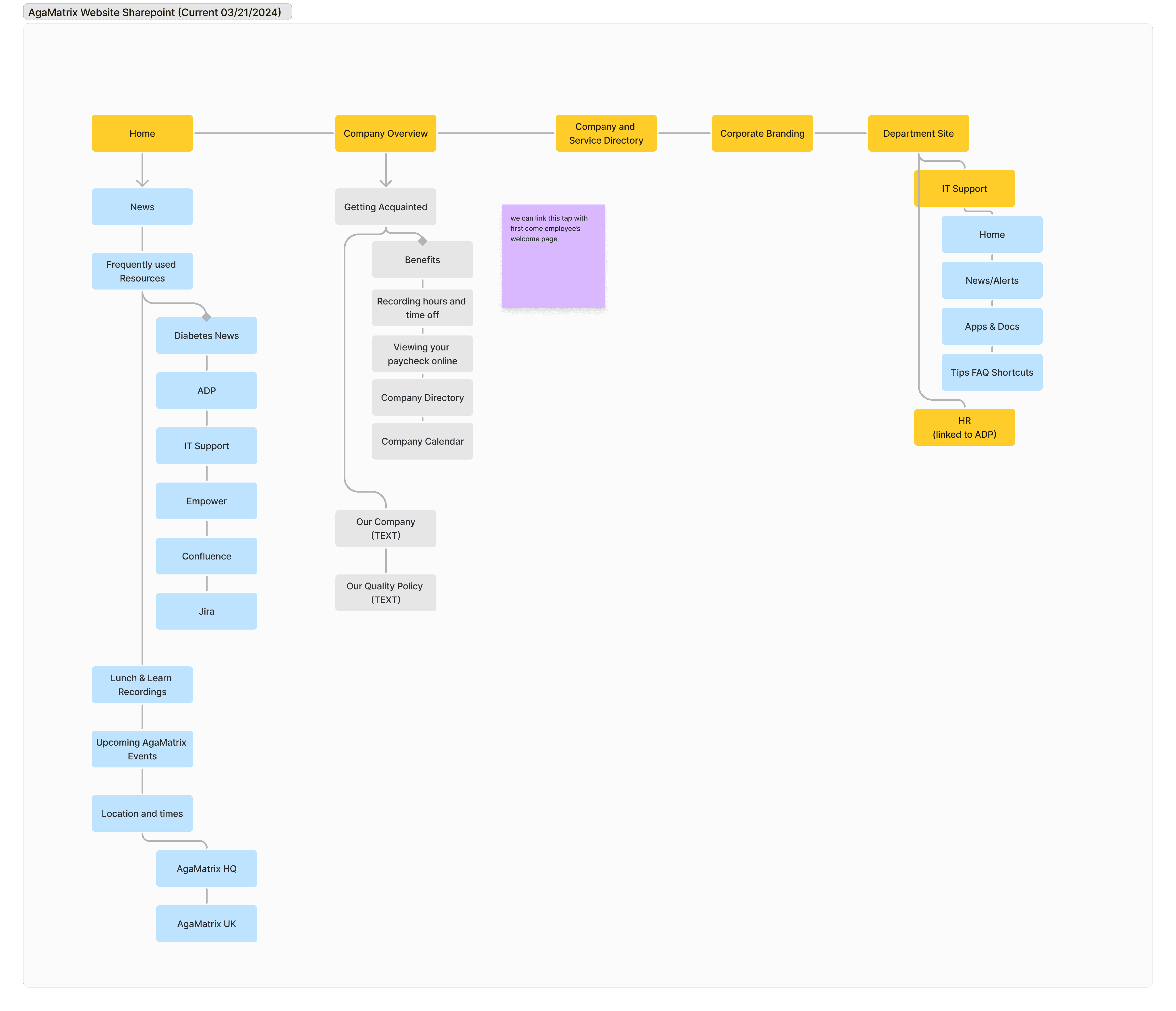
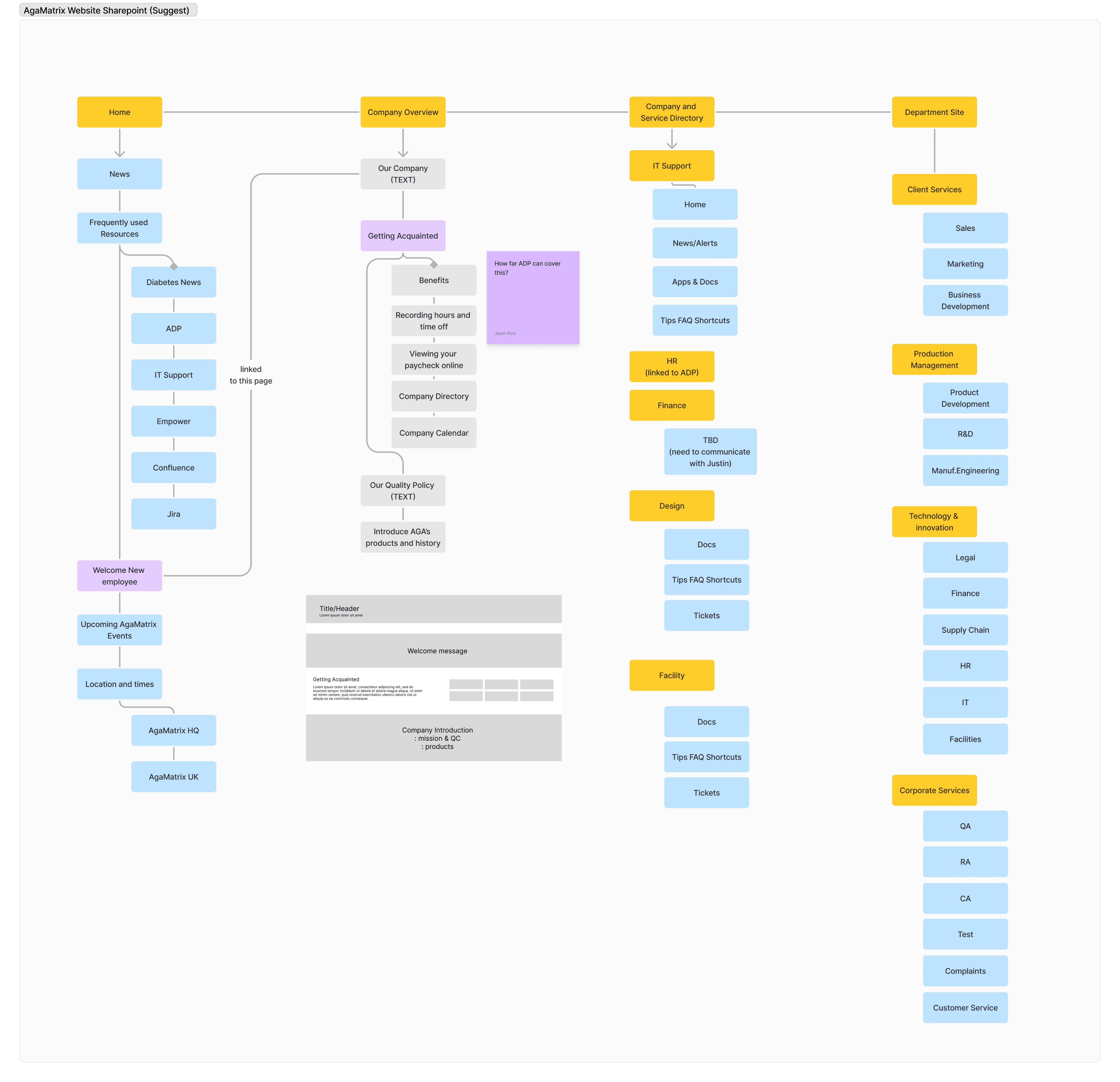


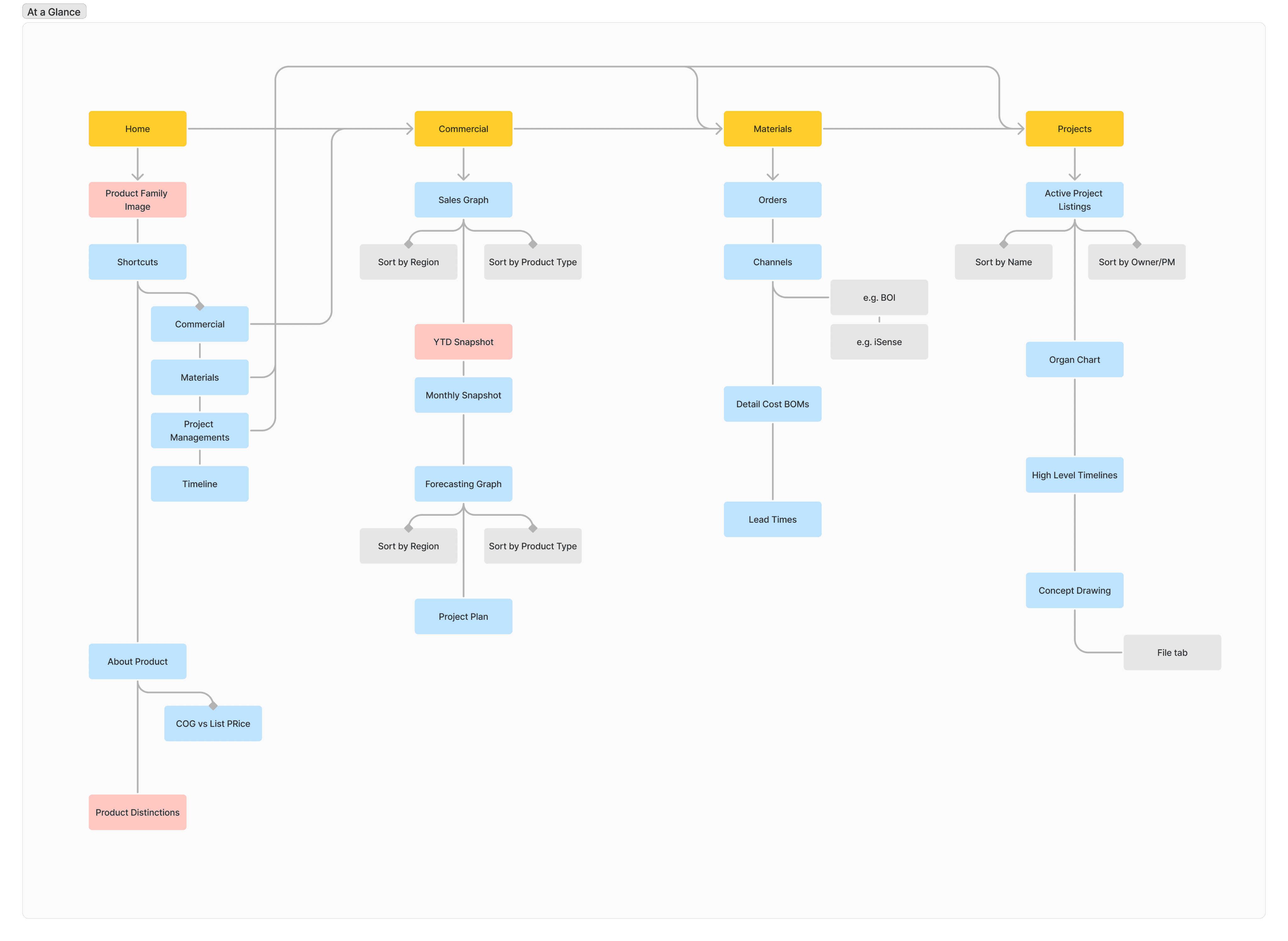
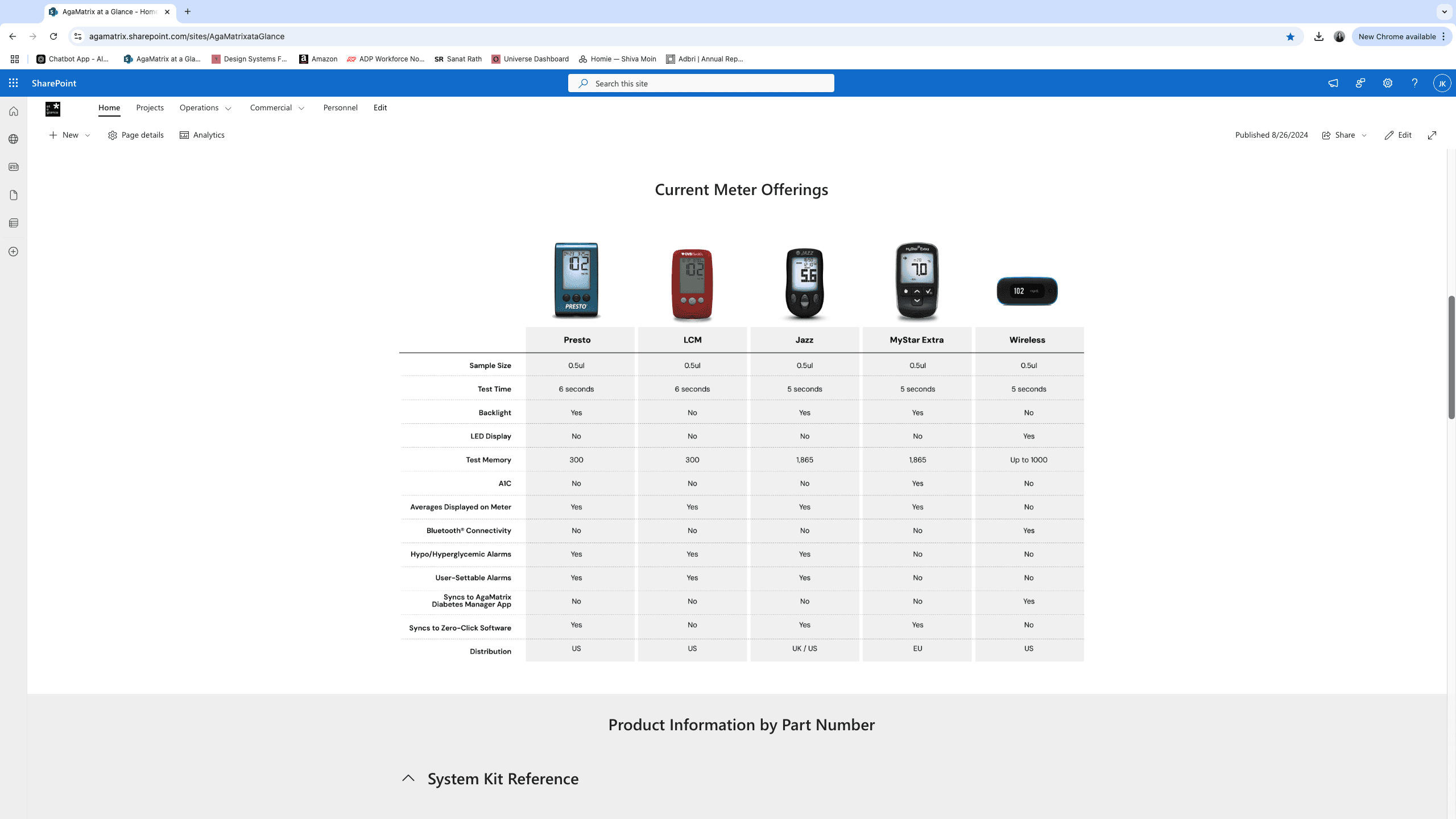
Given the nature of the medical device industry and the need for several departments to closely monitor product updates, a dedicated "At a Glance" webpage was created to provide a centralized overview of product status.


Webpage made in Sharepoint
SOLUTION & EXECUTION
Considering the project's budgetary and temporal limitations, Microsoft SharePoint was selected for its robust sharing and collaboration functionalities.
Could we create a dedicated page for departments that collaborate closely with other teams?
Commercial Team
We want a tab with more detailed product information. We want to use the website to keep product information current, and easily share updates with relevant departments.
Regulatory Team
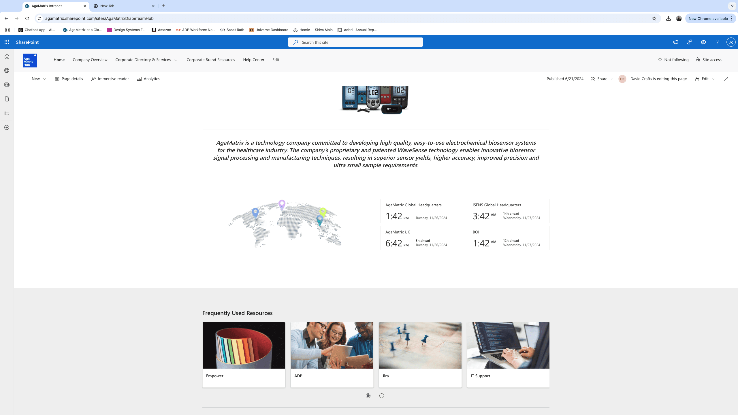
Build New Intranet in Microsoft Sharepoint
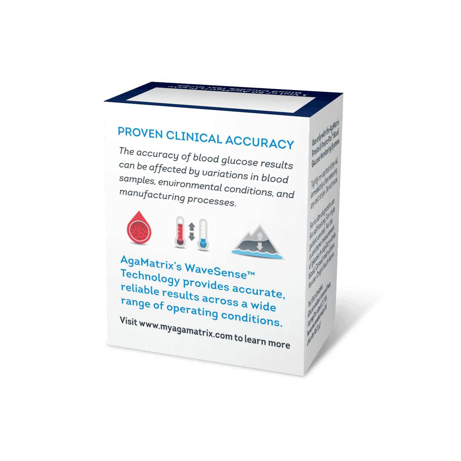
"Our aging brand identity lacked modernity and trust, impacting perception and usability across digital and physical platforms."
Key Challenges
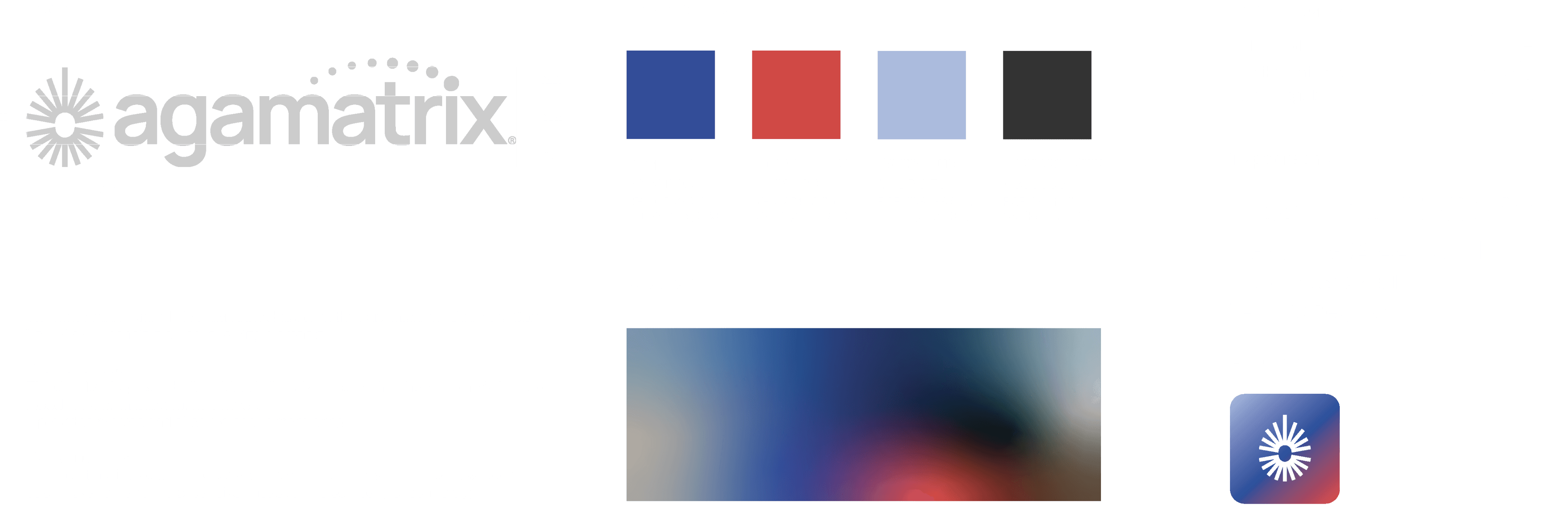
Outdated skeuomorphic logo design.
Difficulty maintaining consistent colors across platforms due to complex gradients.
Lack of professional and modern appeal in branding.
PROBLEM DEFINITION
SUBSECTION 1
Brand Identity Redesign
Conduct Internal Survey
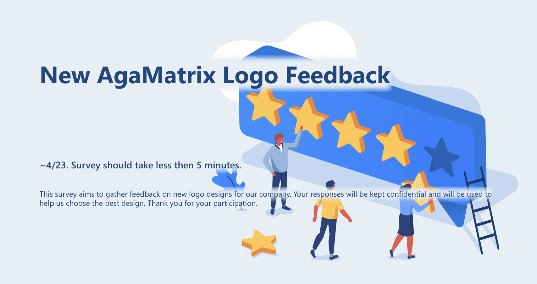
To better understand the AgaMatrix brand image and color preferences, conducted an internal survey of 35 employees over a two-week period to understand brand perception and identify areas for improvement.
Key Findings
To maintain brand recognition while subtly modernizing the image, the rebranding retained the existing logo, focusing on color and form adjustments while upholding the core "Accurate, Affordable" identity.
Redesign Brand Identity
Transitioned from skeuomorphic to flat design for a modern aesthetic.
Updated the color palette to a bold blue with complementary grey tones, ensuring consistent application across digital and print platforms.
PRE-REDESIGN
RESEARCH & INSIGHTS
Key Elements for AgaMatrix Branding
65%
Recognition
20%
Professionalism
8%
Simplicity
Old
New
SOLUTION & EXECUTION
Aspect
Key Finding (Before Redesign)
Impact of Redesign
Logo Elements
70% prioritized Recognition
20% valued Professionalism
10% preferred Simplicity
Simplified for clarity and increased recognition.
Modernized design aligns with professionalism.
Eliminated unnecessary elements for cleaner visuals.
Color Preferences
50% preferred Blue, symbolizing trust and reliability.
30% supported Blue & Grey combination.
20% chose “Other Colors”.
Adopted a bold and consistent blue palette.
Incorporated complementary grey for a modern aesthetic.
Focused on the majority preferred colors
Satisfaction
Initial satisfaction was 50%
Increased to 80% post redesign based on internal feedback.
Redesign Brand Identity
Transitioned from skeuomorphic to flat design for a modern aesthetic.
Updated the color palette to a bold blue with complementary grey tones, ensuring consistent application across digital and print platforms.
SOLUTION & EXECUTION
Impact after updates
Satisfaction increased by 30% based on follow-up surveys.
Enhanced brand trust and professional appeal across stakeholders.
IMPACT
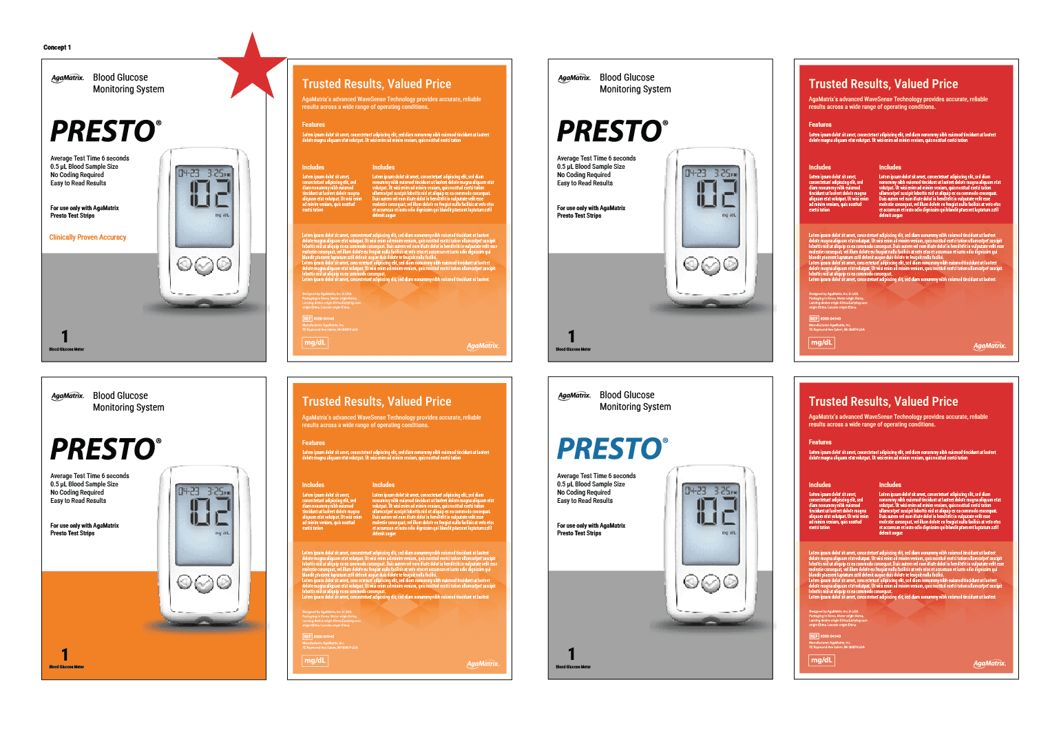
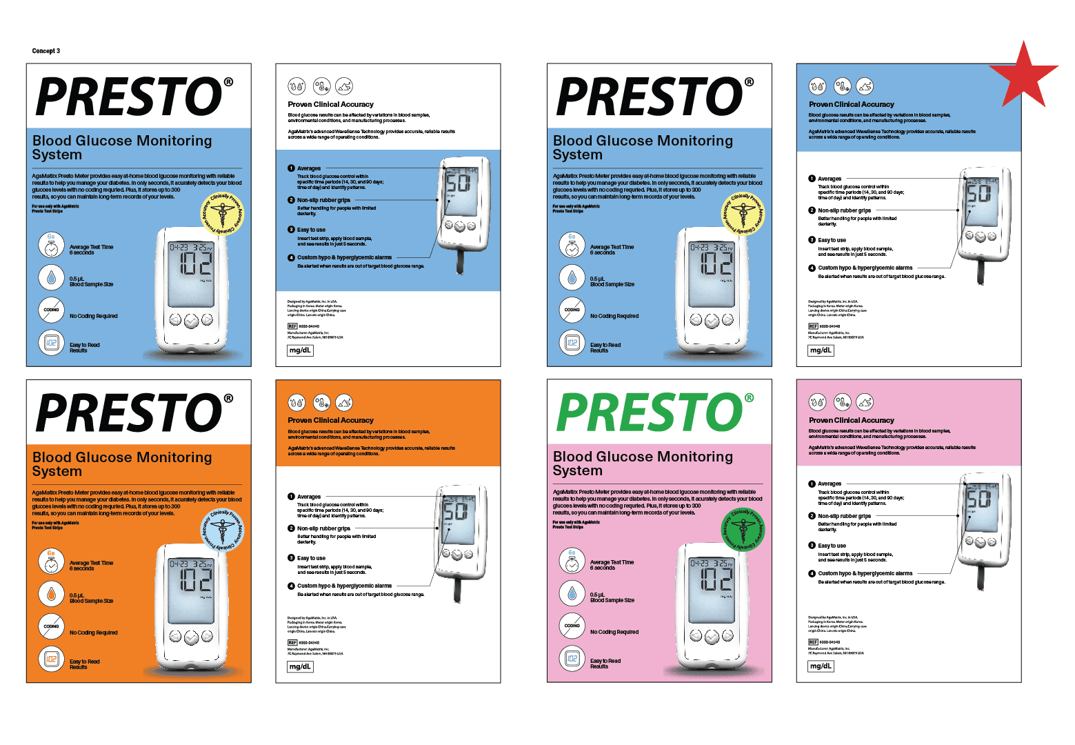
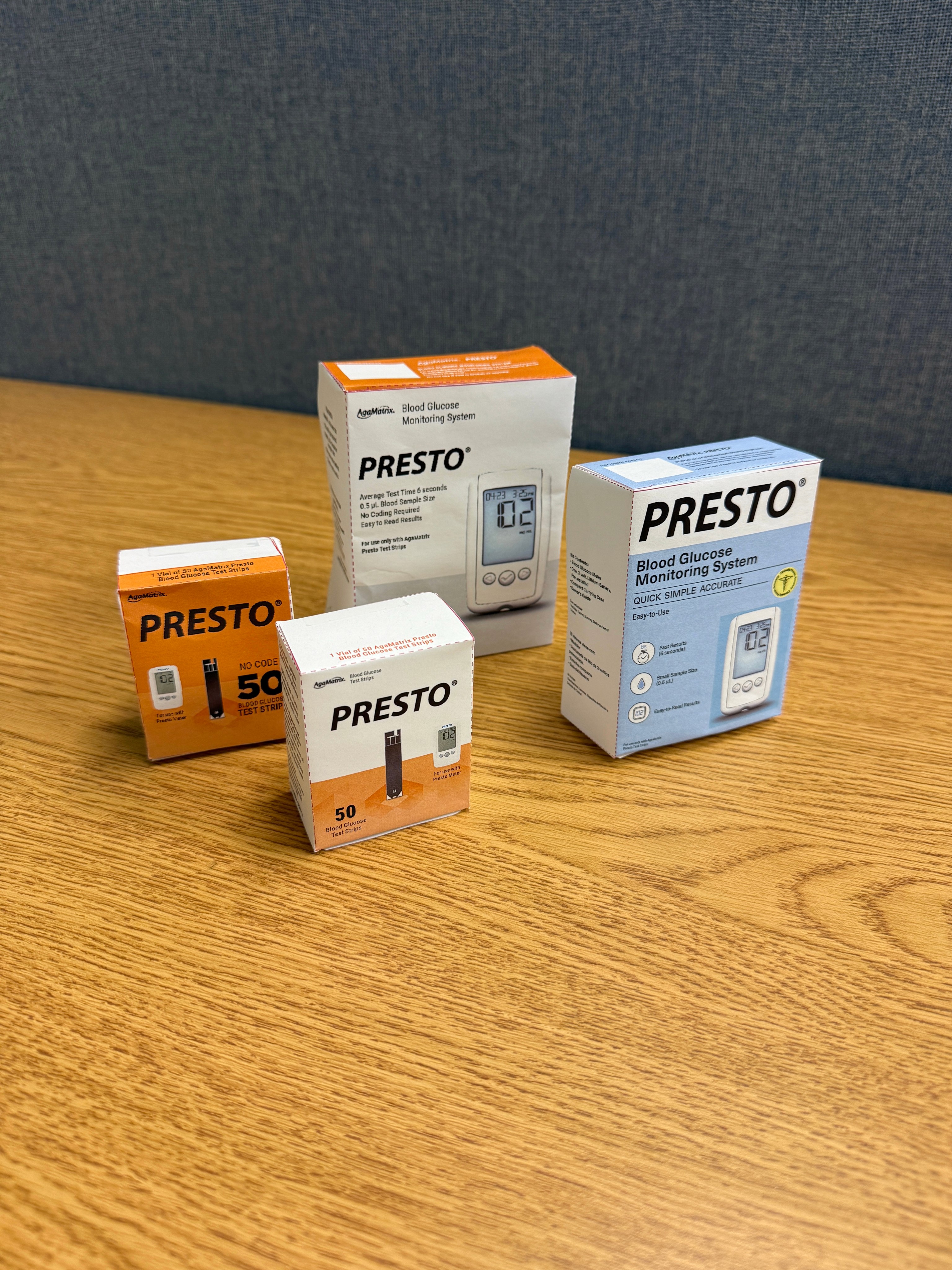
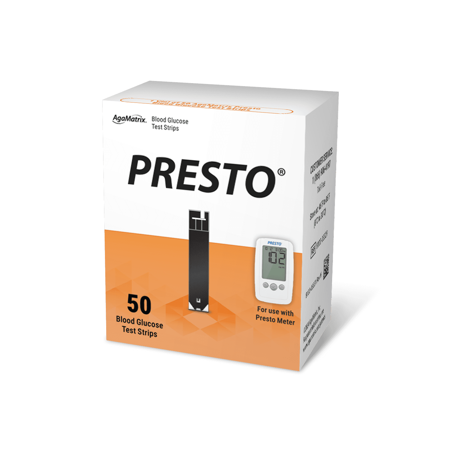
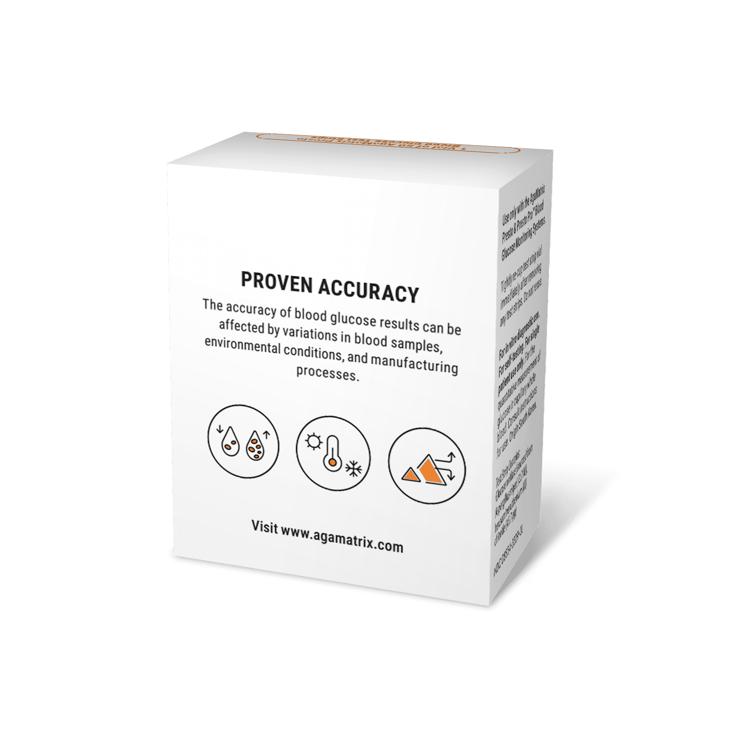
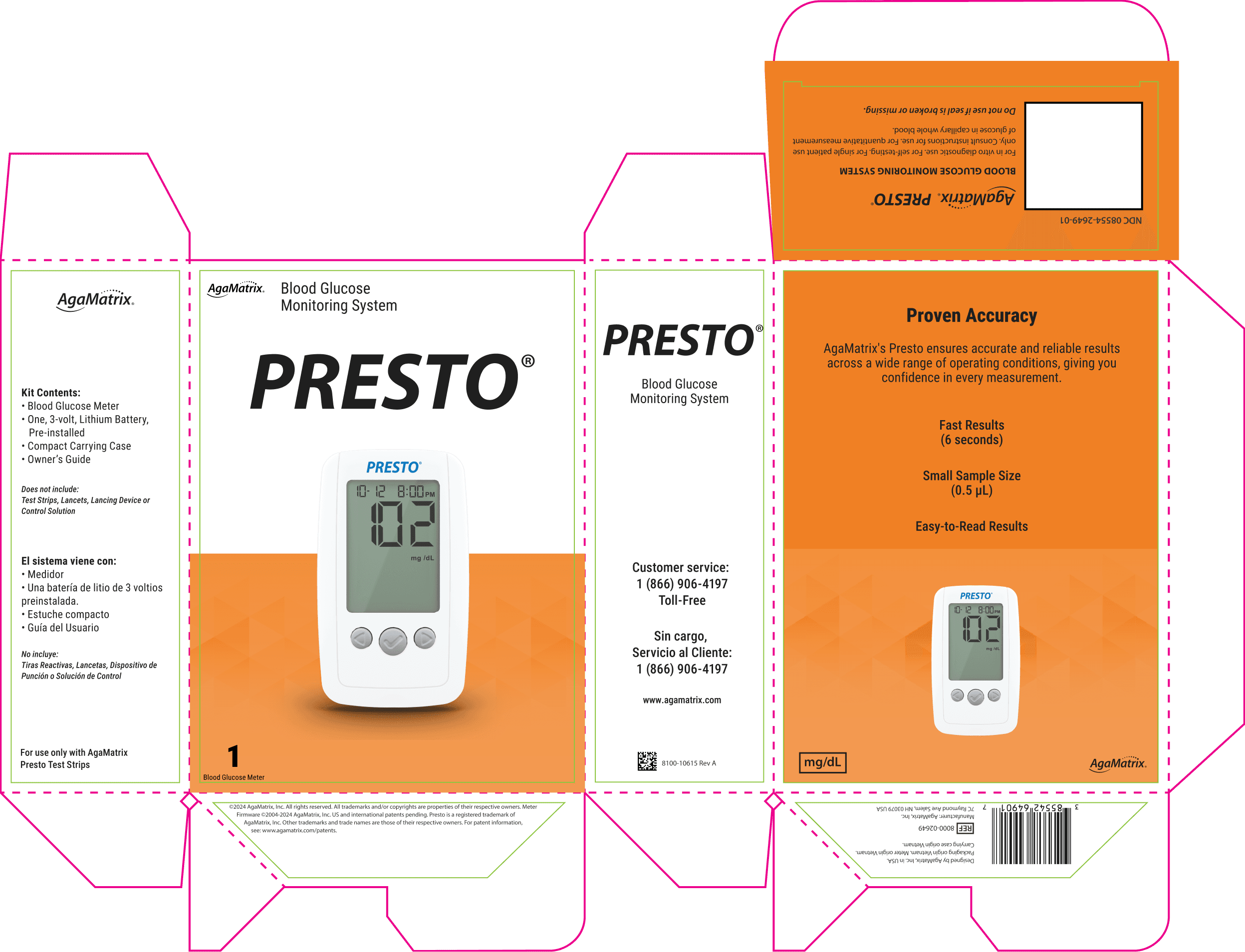
Modernizing Presto’s Packaging and Materials to Balance Cost Efficiency with Brand Perception
The Presto meter and test strip reskin project aimed to reduce production costs while maintaining AgaMatrix’s updated brand identity. The project involved redesigning the carton packaging for the Presto meter and two types of test strips, as well as their owner’s guides, to align with these goals.
As the lead designer for this project, I was responsible for:
Designing the carton packaging and inserts for the Presto meter and two types of test strips.
Worked closely with the regulatory team to navigate complex FDA requirements, ensuring all designs met compliance standards without compromising visual appeal.
Impacts:
These designs contributed to a 15% reduction in production costs while reinforcing brand consistency.
Refined the packaging design through three iterations, addressing stakeholder concerns around readability and print efficiency.
This experience reinforced my ability to balance regulatory constraints with creative design solutions under tight deadlines.
MY ROLE
OVERVIEW
SUBSECTION 2
Blood Glucose Meter Packaging Redesign
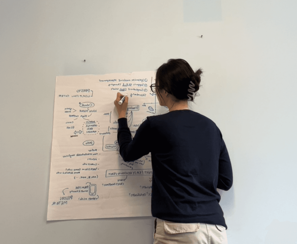
Analysis target group and design theme
I began by analyzing the existing designs and identifying areas for improvement in line with the updated brand guidelines.
Draft Key Concepts and CMF Research
Drafted initial designs with a focus on print efficiency, cost optimization, and maintaining a visually cohesive brand presence.
Feedback & Iteration
Collaborated with internal stakeholders across three rounds of reviews, addressing feedback while ensuring the design stayed aligned with project goals.
PROCESS
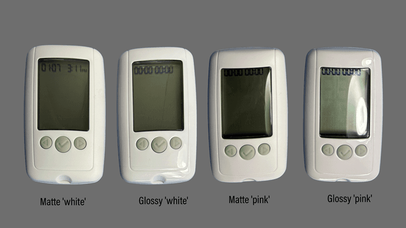
Survey Details:
Duration: 2 weeks
Participants: 20 individuals
Methodology: Participants physically interacted with the product prototypes before completing the survey.
Key Insight:
Glossy white housing emerged as the top choice, recommended by 61.5% of participants, highlighting its alignment with aesthetic preferences despite concerns about stability.
3 round of iterations
quick mockups
Finalization
The final designs were approved as submitted, demonstrating their alignment with stakeholder expectations and project objectives.
Redesigned version
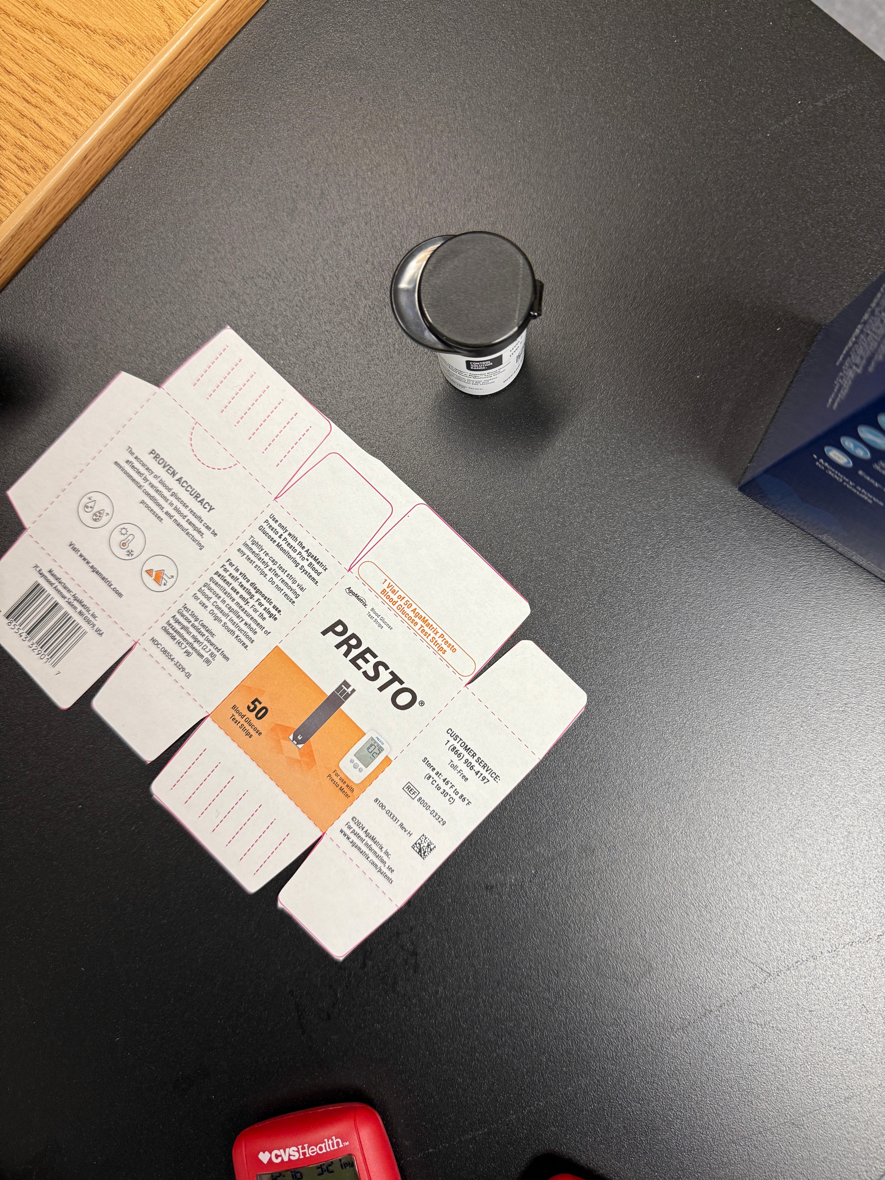
Dieline for package
Old Packaging
Dieline for package
Dieline
Dieline
Dieline
Dieline
Dieline
Dieline
Dieline
Dieline
Dieline
Dieline
Dieline
Dieline
Dieline
Dieline
Dieline
Dieline
Dieline
Dieline
Dieline
Dieline
Survey Results in Graph
